Monday 28 November 2011

First Video Shoot

Our first video shoot didn't go as planned; an singer or rapper didn't turn up and we were left to do some quick thinking as we had already booked the hospital. Although a lot of things didn't go to plan we managed to get some good shots in the hospital and our quick thinking came in handy. 
Its just going to be the Young girl in the instrumental and the singer and rapper will come in when the singing starts. 
Over the Shoulder Shot. 
Lexi (our actress) was able to do a lot of different angles with us and worked well with us .
we experimented a lot on the shoot doing different shots and ideas but trying our hardest to follow the story line.


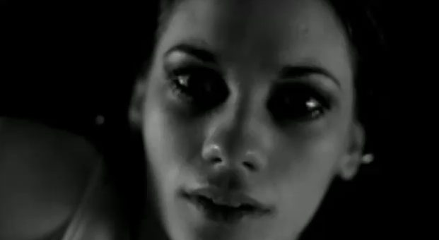
This is one of the close ups that we did for the instrumental. We wanted to have a close up to introduce the actress in the Music Video, as close ups are quite intruding and tells a lot about a person/ Character. 
Lexi, Our actress - Close up 


Actress for the Ateam video - close up
Above, shows the similarities between our close up and the director of the A teams videos Close up. Although we want to expand on the dramatics of our music video we have always kept the Ed Sheeran Ateam video in mind. 


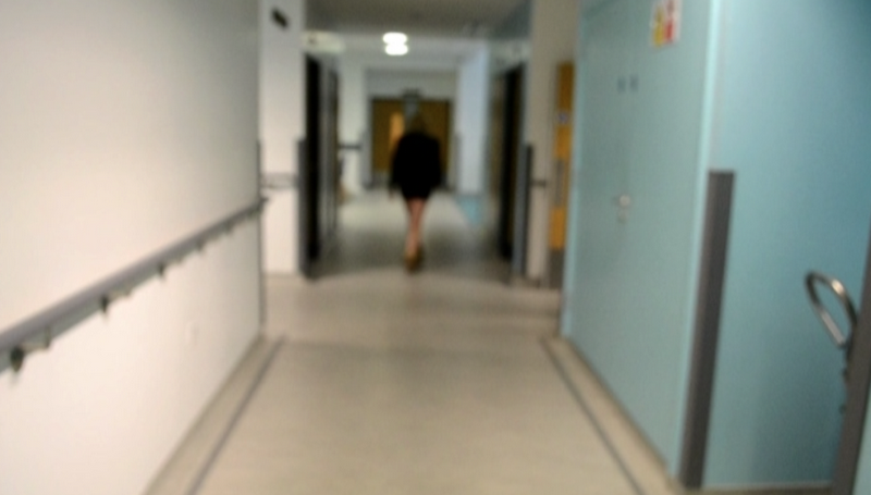
Our hospital shot blurred 

Ateams shor Blurred 
Although we tried to keep in mind the Ateam shot we didn't even think about the blur to effect on it. We only realized it after we shot which I thought was good

Even though a lot of things didn't go to plan we still managed to do a lot of things and now have a decent amount of footage to play with. 


Past students websites.


This website got 10/10 as it goes along with all of the technical skills required for a good website. It also fits in with the genre of the artist as its very pink and girly, showing it is in the female pop genre.

This website got 8/10, again it has all the technical skills shown. It contains relevant performances images which shows its in the 'Indie' genre. The colours are different to the previous website, they are a lot more subtle and are cooler tones to it ( blue, greens) which works well with their genre.

This website got a much lower mark as it does not have enough information and looks unfinished. However the colours do fit in with the artists genre but it just doesn't seem interesting to look at. 

Monday 21 November 2011

CD Cover Tutorial


From this video we were able to discover how to import pictures for the background and to create an effect by changing layers of different images. Also we learnt how to change the colours of the pictures to create a realistic effect. The speaker made us aware of what buttons to press in order to create these techniques and made us aware that we need to pay attention to fine detail - for instance removing of the white line. From this video we are able to understand what our cover requires for example: background, props, artist, text - title and artist's name and images relating to our song/style/genre.

Wednesday 16 November 2011

Our Shooting Dates

Our Dates and Locations:
21st November 2011 - Kings Mill Hospital
27th November 2011 - Kings Mill Hospital
30th November 2011- School
30th November 2011- Graffiti Wall

Tuesday 15 November 2011

Test Shot - Main actress

This is our actress Lexi. The make-up she is wearing is subtle and natural, which we want to create for the first part of our music video where she is in the hospital.
An idea for this is the original song and video 'A team'

In the first part of this music video she is dressed in a coat simple make-up and scarf, so basically very causal and normal day to day costume.
The first picture above is a costume we aim to acheive, we want the actress to look natural and normal so that we see her as a normal girl that we would see everyday and that we could also relate to.


As you can see in the second part of the video this actress' makeup is much more extreme and dark. She has dark eye makeup, hair scraped up but messy and although the video is in black and white she has lipstick on.
We want to take some elements from this music video but make it more drastic.
We want very dark eye makeup thick porcelain foundation: to make her look washed out and tired but we want bright lipstick, i.e red or pink.

We chose Lexi as our actress as she is a blank canvas, does acting already and knows what we want from her. Shes relatable, young and is very easy to work with.

Monday 14 November 2011

Analysis Of Our Website Design

Our Website Design:
                We believe that our website design has a mixture of information, graphics and areas that represent our artist's image. For instance we have chosen to use the bold colours: black, orange and white, as the audience recognise and relate Ed Sheeran's image with these colours. Also the layout of our website is simple making it easy for the fans to access useful information; as well due to our website research of other Indie artist's website pages we were able to see that this was a technique used, connecting our artist with the Indie genre once again. The text fonts alter throughout the website as the larger and bolder font is used in order to highlight important information for example Ed Sheeran, purchase of 'Little Lady' and where to access other useful links. The design of the title originates from his past CDs as seen in Ed Sheeran's album '+' which uses type writing style for the title of the tracks, creating a connection between his music and his website page. We wanted to include a picture of Ed Sheeran in order to sell his image to the public, making them able to recognise his appearance which increases his fan base. The logos of the fan following websites that we have inserted: 'Facebook' and 'Twitter', are necessary for the artist to connect with their target audience and to widen his audience. By including interesting information about the artist, his biography, this gives background information of the Ed Sheeran to newer members of his audience allowing them to gain a more intimate understanding of the artist.

Test shot

Performer : The rapper  - Ashley

Hair style, Make-up: hair style can stay the same he might wear a hat, we just want to keep the look very casual.
Clothing: Jeans Tshirt Hoodie  to keep it casual and to give him an urban image it goes along with our video theme very well.
Influence on image :


Makeup/Costume ideas/Set Design

In indie music Videos the artist/'s have a natural and urban appearance which we want to create on our main singer, rapper and also our main actor (the girl) by using basic makeup, casual clothing and realistic and relatable environments.


Costume: 
From this image of our artist Ed Sheeran we are able to see what is needed to represent our indie theme. For instance he has plain casual clothes i.e blue baggy jeans, his infamous hoodies, trainers and messy hair. Although his clothes probably aren't cheap they do appear to be when you place this artist along side another, such as Michael Buble wears suits and smart clothing; this image of Ed Sheeran definitely contrasts with Michael Buble's image and his music however Ed Sheeran follows the conventions and dynamics of our chosen music genre.
Set Design:
We want to use environments that show day to day life, an area that the audience can relate with and shows how society ignores troubled people and how life still goes on with or without them. 
The locations we have chosen to use are: A hospital, a school, a house and the outdoors we chose these locations as everyones been there making it able for them to relate to the atmosphere, surroundings and circumstances. 

recee Sheet


Location : Crs Studio carlton hill.

What we would film here : A  variety of shots using the graffiti walls as the background.

Public usage: This is a quiet part of carlton at the back of the mechanics and studios therefore there will not be a lot of people walking by and will be very easy to film here. Some of the walls are in the studios private basketball courts  and i have permission to use them from the studio manager.

How well lit is the site? : The site is very well lit in the day time as it is out in the open, however i think we do not need it to be to lit up as we are not making a happy video therefore it will not be necessary and less lighting will work with our theme better.

Will we need extra lighting?:  i don't think we will any extra lighting in this location if we are filming in the day.

Will the camera need white  balancing? : Yes

Are there any background sounds? : Yes there maybe some background sounds of car passing people talking etc, however this will not effect our shoot as we will be lip syncing over it.

Health and safety : There is no Health and safety issues.

Evaluation :

  • Suitability - 9/ 10
  • Public usage - 7/10
  • Power supply - 10/10
  • Space to move - 10/10
  • Lighting  - 9/10
  • Background noise - 7/10
  • Health and Saftey - 8/10

Wednesday 9 November 2011

CD Cover Digipak

 Below is some ideas of how we intend to meet the marking criteria for our CD digipak:

We are aware of our genres conventions of having simple layouts and we've decided that want to have a theme of black, white and orange throughout. Evidence that these colours represent our artists style is shown on his website plus on television advertising. 

We are aware that Ed Sheeran uses 'typewriting' and handwriting styled fonts, although we want to capture some of these elements we are aware that we need to use a variety of fonts and text size so that we aren't completely following and using all of his ideas. By using different text sizes it will highlight important information that we want to emphasize to the listener; for instance albums name and artist. 

The language that we will use shall be simple and in a informal register we want it like this as indie genre is very relaxed therefore following this style of other indie artists, however we will not be using slang, foul or inappropriate language as we still want our artists image to be a good role model for younger listeners.

We realize we need to use the appropriate ICT equipment such as 'Photoshop' to make our  CD cover appear professional and realistic. 
   
we are going to have a mixture of images with a minimal amount of necessary text as this is a technique that Ed Sheeran used on his '+' album and other other indie artists also use this, making it easier for the audience to understand the image. 

We want to take appropriate use of shots on set so that we have a variety of different shot types to choose from for our CD cover. For example close ups of our rapper and singer side shots low angle shots etc all these shots are the type of pictures that are used on indie genres CD covers.  We want to take these pictures on set so that the pictures are relevant and so it links with the music video. 

The Mise-en-scene that we are going to use will highlight the urban environments as this will stress the conventions of indie style music and relate to his target audience. On our music CD cover we are thinking about using the black and white effect that Ed Sheeran does on the 'A team' video. When we shoot our scene at the graffiti wall we will also take pictures and use 'Photoshop' to make it black and white and perhaps change the colour of the writing to orange.  


To construct all of these ideas we are aware we need to do a professional job on editing and manipulating our pictures of 'photoshop' in order to sell the CDs. All of these editing methods consist of cropping and resizing photos properly so that the are appropriate to sell his required image. 


This is a picture of Ed Sheeran's current website page is an example of the styles he uses including colours and fonts.


CD cover - Digipak

Images we will need to photograph :

  • Close up of singer
  • Photo of singer and rapper 
Props we would need to include : 
  • Guitar
  • Outfit - Hoodies, jeans etc.  


Our design template for our cd cover fits in with the marking criteria of level 3, possibly level 4 depending on the final product. The images used have different shot  lengths and will fit in with the theme of our song and genre. We will have an urban background for the images to show the audience what sort of locations we will be filming in . We will edit our pictures to make them eye catching and unique and we will include photos of the two artists in the digipak to show their image to the audience. I think the colors shouldn't be too bright as bright colors are not used in the indie genre very often. 


  • Awareness of conventions of layout and page design - Our digipak will use a simplistic colour scheme, using the colours; orange,black and white. We will show the artists name on the front cover which is important for selling the cd we will also show a photo of the artist 


Monday 7 November 2011

Full Step Outline


Lighting For Our Video


This Displays the use of  three point lighting and its effects. We used this video as its simple, clear so the instructions are easy to follow. 

In our music video we want to use natural lighting in environments in ares such as; the hospital, the graffiti wall, and out side the school. The places we might need the lighting is in the house and at night. 
An example of this is wretch 32's Video 'Don't Go' alot of this is filmed outside and uses alot of natural lighting. This is the effect that we want to create in our music video as other Indie videos have a natural, realistic and believable lighting therefore sticking to the Indie genre. 

Thursday 3 November 2011

Website Analysis

I looked at Indie genres websites to see what kind of themes we could adapt to our own website. The ones that i came up with were either colourful like the wombats

as you can see its very colourful, in blue which is generically a boys colour which in someways shows their youthful side and it isnt a dark or depressing colour which shows they are quite young ans quirky.


as you can see ed sheerans site is alot more simple and when you first go on to it its a black and white shading of his figure, we plan on using this idea more than the clolourful ones and taking the video aspects and maybe even the type write font that ed sheeran uses.

website research


I had a look at different indie websites to get an idea of the layouts themes and colours they used to promote their music and themselves as an artist or band. This gave me a good idea of how we could set out our own website for Ed Sheeran and what sort of style we should go for. All websites have near enough the same links on them which are always made very clear for whoever has come onto their website so they have easy access to other parts of the site. Links to the; Homepage, Tour dates, Videos, Gallery, Shop are near enough always available along with a link to be able to contact the band in some way. Quite often there are links to the bands Facebook Twitter Youtube and Myspace pages a long with other social networking sites the band may have. This is very good for promotion and makes the fans feel a bit closer to the band. The first two sites i researched had  no images or videos of themselves on their homepage, may be they do not want to be in the limelight and prefer their fans to focus on their music rather than their image. I think this is good however i think they way Keane's site has videos of their performances on their site is very good free advertisement and promotion and i think that the other to bands are missing out, so i think our website will contain images and videos of our artist.
The colours used in the sites vary, however all of the colours are washed out or pale and keanes is in black and white to be very subtle, this goes along with the indie conventions well so i think we should also go for dark colours or washed out colours. The layout of the websites are very organised so it is easy for the audience to navigate themselves around the webpage which i think is extremely important as it makes it a stress free browse for the audience and reduces confusion.
On all of the sites i looked at the band or artists name was the first thing that is seen on the homepage as its a lot larger than the other writing on the page and bolder with alot of contrast to the background making it clear and stand out so we shall do the same for ours.

Location photographs

This is our first location we plan on shooting in. Its Kings Mill Hosptial in Mansfeild and its notorious for the Lights that shine outside at night.
We chose this hospital as we hoped it wouldnt get as busy and manic as perhaps Queens Medical Or City Hospital and also as we plan on filming early in the morning it should be light up nicely and it would have a nice effect on our music video.
This is an Inside shot of Kings Mill hospital


This is another Place where we would like to film, we like the idea of the graffiti wall to show that we are in an urban destination, something that comforms to the conventions of indie/ukgrime music videos


Music Video Research

Camilla Smith's Music Video Analysis

Non Verbal Communication

I chose this video from Ed Sheeran as it shows a very different side to his personality. Although a lot of his videos are performance videos hes never done one in a studio shwing how he lays down his work, this sort of builds a relationship with this artist in a different way, we now know he has fun in the studio and all his work is written down and its all his own.
Costume: They are all wearing their own casual clothing and Ed Sheeran  is wearing his infamous tight necklace. They show that they are comfertable and they like to be comfertable whilst recording their music

Gesture: Although they are talking in the video we dont hear this, but through the use of smiling, laughing and pointing we can see they are having a good time, its casual and they dont always take everything serious even though they all make very contraversial and serious music. This is also another technique to show the artists human side and this is a technique that conforms to the conventions of indie/ukgrime genres. Although this is a performance video in a studio booth we see the ins and out and feel, as an audience, we are there beside them. This is soemthing that a lot of producers try and sdo at gigs and so on.

Imagery: 'You need me man i dont need you' As says this theres a different flash back shot of Ed Sheeran at a gig performing. This is why some critics can see he comes accross as arogant. Him saying 'you need me' to an audience but he doesnt need them is sort of saying he is ungrateful for all of his fans, but infact he is saying that he doesnt need all the fame he just wants to perform because he loves music, which also shows his human side.

Space from camera: There are alot of different shots, from close ups to long distant but the space of the camera is always maximised and used to its fullest. There are alot of close ups to show all the artists reading their lyrics and playing and having banter, then there are long shots of the crowd and the body language between each artists.

Voice and Tone Pitch: This is a fast paced song but all of the artists clearly know their music and keep to the pace of it well. It never gets boring as it is quite interestign to see the relationships of the artists with eachother.

Facial Expressions: As i said before all the artists are laughing and joking. Evin in some of the srious lines of this song they are laughing to show the viewers that this song isnt entirally serious.

Camilla Smith's Advanced Portfolio: Music Video Storyboard


Wednesday 2 November 2011

Digipak Research

This is an Arctic Monkey digipak.
The front cover shows an average looking man dressed in a plain t shirt having a cigarette in front of a curtain backdrop, all in black and white. The front cover goes along with the indie conventions perfectly; very casual and plain rebelling against the glamorised pop culture. Also the fact that the band are not actually on their own cd cover may tell us that they do not enjoy the limelight and celebrity culture but just like to make their music.
 The front cover is a lot more contrasted compared to the back of the cd case this would be to make the contents of the cd stand out more against the background.
The actual cd is covered in cigarette ends so it stays connected with the theme of the rest of the digipak but it also gives this sense of rebelliousness.


 This is a Killers digipak. Again the front cover is in black and white and have a uniqe vintage look to it because of the odd location ( dessert) and the black suits. The posed look they give is very moody and mysterious which goes along with the indie conventions clearly. All of the band are covered in black where as the lead singer has a white t shirt on which is visible, maybe wanting to make it clear to the audience who the lead singer is. The cd looks like an old lineal disk, this is to again give of a very vintage feel.  The photo on the left has red font on it which gives us information on the band itself and their success, this could be a promotion, trying to make it appealing to customers to go to their gigs etc. The red font makes the writing alot clear against the background. Also there are pictures of the bands previous albums this could be to promote other cds the band have made or it could be to tell us that some of the songs from them albums are on this cd. I think the vintage style to this digipak is very unique and would work well to appeal to the target indie audience.